Charts, Gauges, and Dashboards
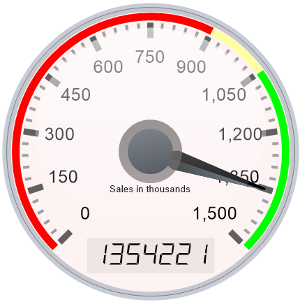
Stonefield Query makes it easy to create great-looking charts and gauges, either by themselves, included in other reports, or displayed in dynamic dashboards. For example, you may want to see a breakdown of your sales by product. You can graph this information as a pie chart, a bar chart, or one of the other chart types to suit your needs.
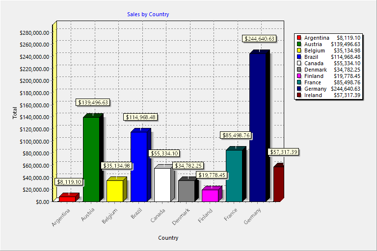
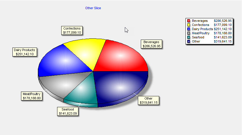
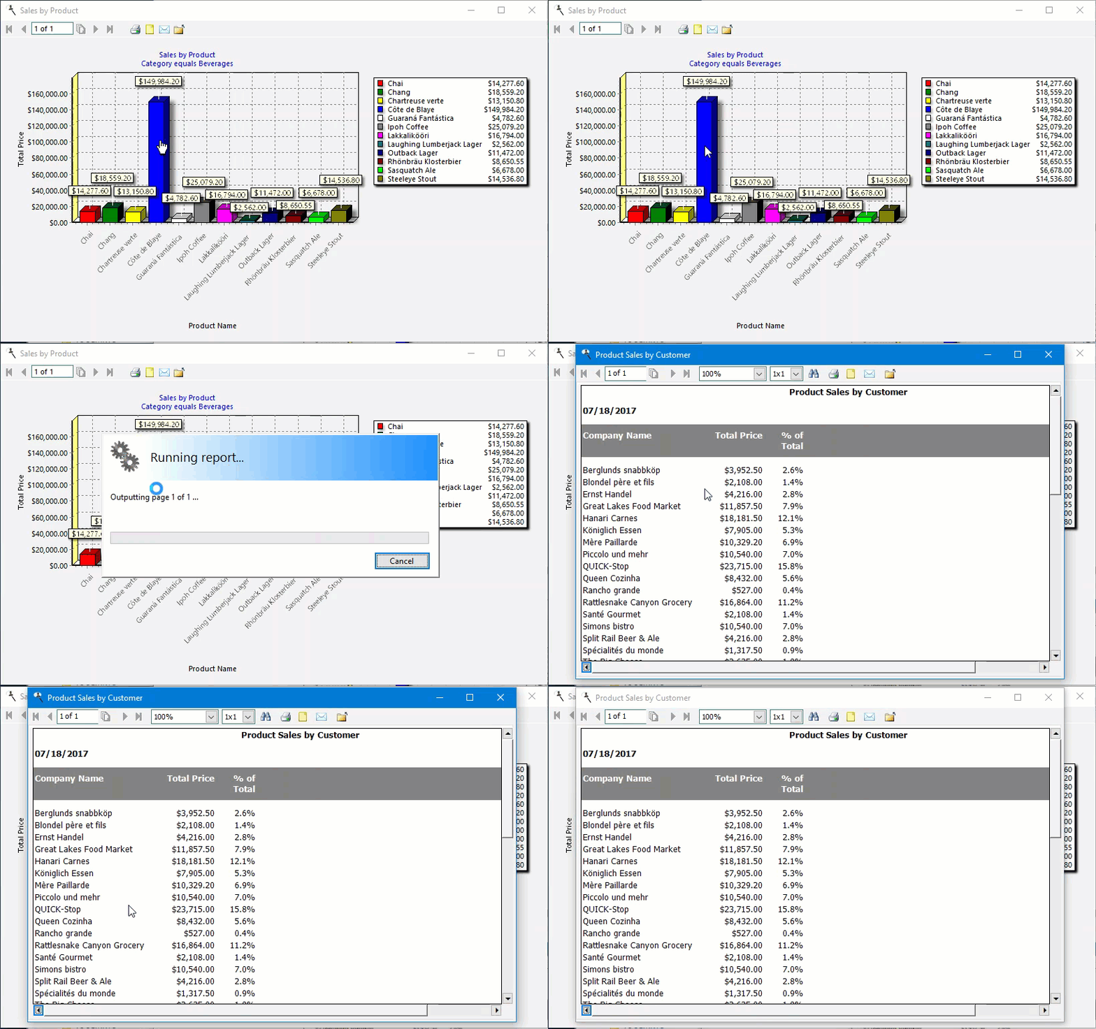
You can even drilldown from a chart by clicking a slice or bar to see the details for that item.
Dashboards
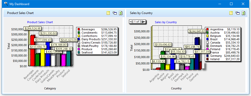
A dashboard is a set of reports that appears in its own window.
Gauges
A gauge report allows you to create a gauge showing the current value of something compared to a target or goal value.
