 Step 2: Select Dashboard Reports (Dashboard)
Step 2, in which you select which reports appear in the dashboard, is shown below:
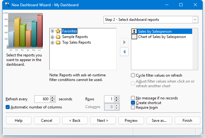
The options in this step are:
A list containing all reports that have not already been selected appears at the left. The reports are organized in the same folders they are in the Reports Explorer; click the + sign in front of a folder to expand it and see the list of reports it contains. Reports that have ask-at-runtime filter conditions are disabled and cannot be selected because dashboards may run unattended and therefore shouldn't prompt the user for any values.
A list showing the reports included in the dashboard appears at the right. Reports in this list may be moved up and down to change the order in which they appear in the dashboard; to do this, click the button in front of the report to move and drag the button up or down in the list.
Add: clicking this button adds the selected report in the available list to the selected list. You can also add the report by double-clicking it in the available list. The report is removed from the available list.
Remove: clicking this button removes the selected report from the selected list. You can also remove the report by double-clicking it in the selected list. The report is added to the available list (although you may not see it if the folder the report is from isn't expanded).
Edit: edits the selected report.
Cycle filter values on refresh: turn this setting, which is only available for chart reports, on to cycle through the range of X-axis values as filter values for other reports when the dashboard is refreshed; see the next setting for how a value in one chart affects the filter values for other reports.
Adjust filter values when click on or refresh another chart: turn this setting on to refresh this report when you click a data point in another chart in the dashboard. This allows you, for example, to have a chart showing sales by year and another chart showing sales by month in a specific year. Clicking a year in the first chart changes the year used in the second one.
The way this works in that if you click any data point in a chart in the dashboard, it checks all other reports in the dashboard to see if they have filter conditions on any field in the clicked chart or any filter condition in the clicked chart (the conditions do not have to be ask-at-runtime and in fact they cannot be since that is not allowed in a dashboard) and have this setting turned on. If so, those reports have their filter condition values changed to the value of the clicked data point and they are refreshed. For example, suppose you have the following charts in a dashboard:
Chart #1 shows Order Date formatted as Year in the X-axis and Sales Amount in the Y-axis (sales by year).
Chart #2 shows Product Category in the X-axis and Sales Amount in the Y-axis, with a filter condition of Order Date is between two dates (sales by category for a specific year).
Chart #3 shows Product Name in the X-axis and Sales Amount in the Y-axis, with a filter condition of Order Date is between two dates and Product Category equals a certain category (sales for all products in a specific category for a specific year).
When you click a year in the first chart, the other two charts change to use that year. When you click a category in the second chart, chart #3 changes to show products in that category for the year. Here is the initial dashboard:
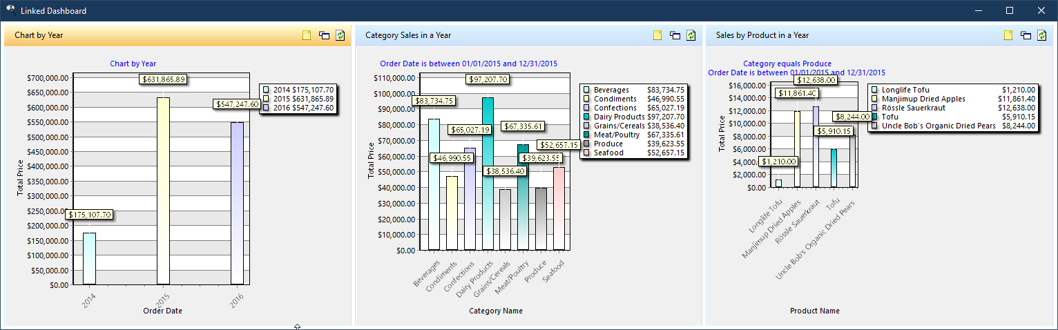
Here is the dashboard after clicking the 2016 column in chart #1:
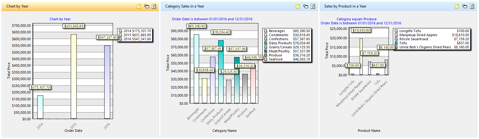
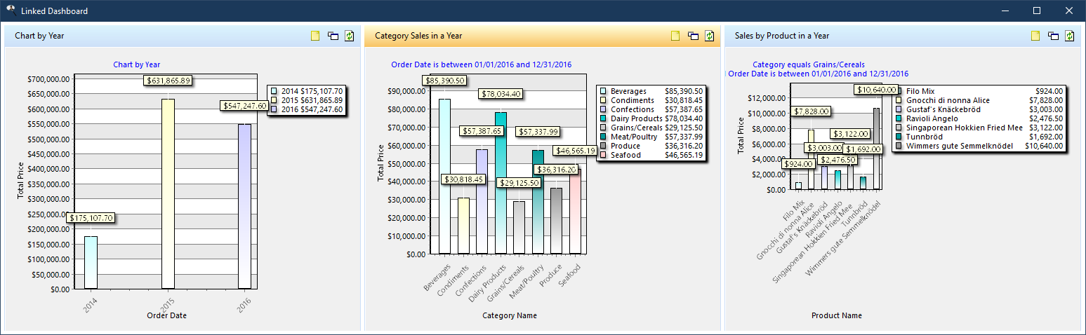
Here is the dashboard after clicking the Grains/Cereals column in chart #2:
This setting works inconjuction with Cycle filter values on refresh. The dashboard automatically determines how often to cycle the values for each chart. For example, suppose you have a dashboard with 4 charts:
Chart #1 has Adjust filter values when click on or refresh another chart turned off since it doesn't change filter values when another chart changes, but has Cycle filter values on refresh turned on because clicking or refreshing this chart should cause the filter values of other reports to change.
Charts #2 and #3 have both Adjust filter values when click on or refresh another chart and Cycle filter values on refresh turned on.
Chart #4 has both Adjust filter values when click on or refresh another chart turned on but Cycle filter values on refresh turned off since no other chart is affected by this chart.
If chart #2 has 8 different X-axis values and chart #3 has 3 different X-axis values, then chart #1 cycles filter values every 24 refreshes (8 x 3), chart #2 cycles every 3 refreshes, and chart #3 cycles on every refresh.
Refresh every: a dashboard automatically refreshes the data in its reports at an interval you determine. The default is every 600 seconds (10 minutes) but you can set it between 1 and 6,000 seconds. This interval is also used to display sets of reports; see the note below.
Automatic number of columns: if this option is turned on (the default), the dashboard window determines how many columns to display based on the number of reports and the number of rows. For example, if there are six reports and two rows, the dashboard has three columns. Turn this setting off to manually set the number of columns, especially if you want to cycle through sets of reports (see the note below).
Rows: the number of rows to display reports in. The maximum value is the number of reports in the dashboard; for example, if you've selected three reports, you can have up to three rows (one per report).
Columns: the number of columns to display reports in. The maximum value is the number of reports in the dashboard; for example, if you've selected three reports, you can have up to three columns (one per report). This option is disabled if Automatic number of columns is turned on.
If the total number of cells (rows multiplied by columns) is less than the number of reports, the reports are cycled through in sets at the specified interval. For example, if you specify two rows and two columns, only four reports can be displayed at a time, so if the dashboard contains six reports, the first four are displayed, then the next two, then the first four again.
No message if no records: with this setting turned off, when the dashboard is run and the filter for a report causes no records to be retrieved, a warning message is displayed. Turn on this setting on to not display the warning.
Create shortcut: turn this option on to create a shortcut on your desktop that runs the dashboard. To run the dashboard, simply double-click the shortcut; you don't need to start Stonefield Query first and the normal Stonefield Query user interface doesn't appear.
Require login: turn this option on if you want to prompt the user to log in when they run the dashboard from a shortcut. With this option turned off, the dashboard runs without login. This option is only enabled if Create shortcut is turned on.
© Stonefield Software Inc., 2025 • Updated: 05/02/25
Comment or report problem with topic