 Bar and Column Series Page
You can change the color used in the legend for the series by clicking the colored square at the top right of the page and selecting the desired color from the dialog that appears.
There are four pages of settings for bar and column series: Format, Stack, General, and Marks. Some of these have several subpages of settings on them.
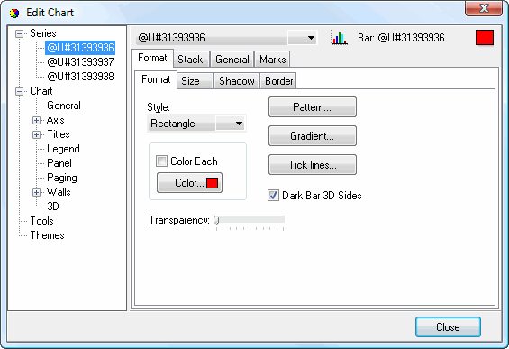
The Format subpage of the Format page has the following options:
Style: this setting controls the shape used for the bars. It corresponds to the Bar Type setting in the Chart Wizard, but has more options.
Color Each: turn this option on to color each item a different color. If this is turned off, all items have the same color.
Color: click this button, which is only enabled when Color Each is turned off, to set the color of the items.
Pattern: click this button to display the Pattern Color Editor dialog.
Gradient: click this button to display the Gradient Editor dialog.
Tick lines: click this button to display the Border Editor dialog. These settings affect tick lines in each bar. Tick lines don't display by default but you can turn on the Visible setting to display them.
Dark Bar 3D Sides: turning this setting on displays the sides of bars in a darker shade of the bar color, giving a shadowed appearance. Turning it off displays the sides in the same color as the front.
Transparency: use this setting to control the amount of transparency (in percent) of the bars.
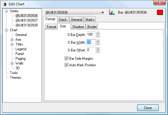
The Size subpage of the Format page has the following options:
% Bar Depth: this setting sets the depth of each bar as a percentage of the total available depth.
% Bar Width: this setting sets the width of each bar as a percentage of the total available width.
% Bar Offset: this specifies how far the bar is offset from its normal position as a percentage of that position.
Bar Side Margins: if this setting is turned on, the first and last bars are indented from the chart axes. Otherwise, the bars appear up against the axes.
Auto Mark Position: turn this setting on to move point labels to the top of the bars to minimize the overlapping effect of labels with long text or big font sizes. With this setting turned off, no such checking is performed.
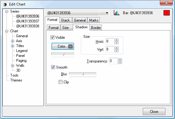
The Shadow subpage of the Format page controls the shadow settings for bars. It has the same options as the Shadow Editor dialog.
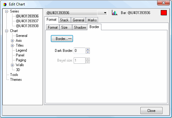
The Border subpage of the Format page has the following options:
Border: click this button to display the Border Editor dialog.
Dark Border: this setting controls the degree of darkness for the border.
Bevel size: this setting, which is only available if Style on the Format subpage is set to "Bevel," specifies the size of the bevel.
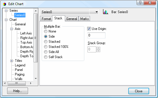
The Stack page has the following options:
Multiple Bar: this setting determines how bars stack when there are multiple series. The choices are:
None: bars do not stack but appear front to back.
Side: bars appear side-by-side with bars from each series grouped by category.
Stacked: bars in different series stack on top of each other.
Stacked 100%: bars in different series stack on top of each other with the height of the stacked bars representing the total for those bars for all series and each bar being the height of its value as a percentage of the total.
Side All: all bars in a series display side-by-side.
Self Stack: similar to Stacked but all bars in all series form one large stack.
Use Origin: this setting specifies whether 0 is used as the origin (turned off) or another value, which you specify in the box below this setting, is used instead (turned on).
Stack Group: this setting, which is only available when you select Stacked or Stacked 100%, allow you to customize which series stack together. All series with the same value for Stack Group stack together. For example, to create two stacks, with the first two series in one stack and the next two in the other stack, set Stack Group for the first two series to 1 and set it to 2 for the next two series.
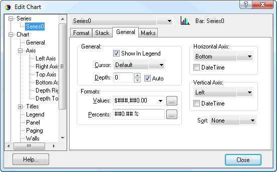
The General page has the following options:
Show In Legend: this setting determines whether this series appears in the legend or not.
Cursor: this setting specifies the shape of the mouse pointer when it's over any bar in this series.
Depth: you can control the depth of the bars in this series using this setting.
Auto: turn this setting on to automatically determine the depth of the bars.
Values: this specifies the format for values in the Y axis. You can either select one of the commonly used formats from the drop-down list or click the button beside the list to display the Numeric Format dialog.
Percents: this specifies the format for percent values. You can either select one of the commonly used formats from the drop-down list or click the button beside the list to display the Numeric Format dialog.
Horizontal Axis: use this setting to specify the location of the X axis labels. The choices are Top, Bottom (the default), or Top and Bottom.
DateTime: there are two settings, one for the horizontal and one for the vertical axis. Turn the appropriate setting on to format the labels on that axis as date and time values.
Vertical Axis: use this setting to specify the location of the Y axis labels. The choices are Left (the default), Right, or Left and Right.
Sort: this allows you to specify how bars sort. The choices are Ascending (bars display with the smallest value at the left and the largest at the right), Descending (the opposite of Ascending), or None (the default).
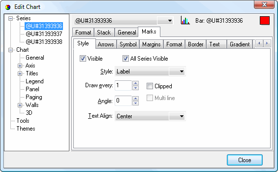
The Style subpage of the Marks page has the following options:
Visible: this setting determines whether point labels display for this series.
All Series Visible: this setting determines whether point labels display for all series.
Style: this setting specifies what text appears in point labels. It corresponds to the Style setting for point labels in the Chart Wizard but has additional options.
Draw Every: if you don't want point labels shown for every point, set this value to higher numbers; for example, 2 means show point labels for every second category.
Clipped: turn this setting on to prevent point labels from appearing outside the chart limits, or turn it off to allow point labels to overlap axis.
Angle: this setting specifies the angle at which to display point labels.
Multi line: turn this setting on to display point labels over multiple lines. This is only available when more than one value is shown in point labels, such as when Style is set to Label and Value.
Text Align: this setting specifies the alignment for point labels: left, center, or right.
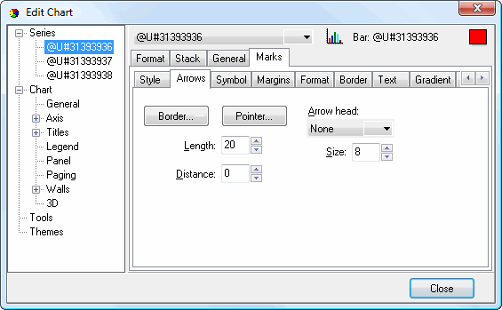
The Arrows subpage of the Marks page affects the lines drawn from point labels to the points in the chart. It has the following options:
Border: click this button to display the Border Editor dialog.
Pointer: click this button to display the Pointer Editor dialog.
Arrow head: select the desired arrow head style from this drop-down list.
Length: this setting specifies how long the lines between point labels and points are.
Distance: this setting specifies the distance in pixels between the end of the line and the point.
Size: this setting specifies the size of the line.
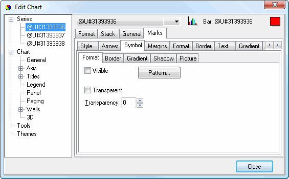
The Symbol subpage of the Marks page affects how legend symbols appear in point labels. The Format subpage has the following options:
Visible: turn this setting on to display legend symbols in point labels.
Pattern: click this button to display the Pattern Color Editor dialog.
Transparent: turn this setting on to display a transparent symbol.
Transparency: use this setting to control the amount of transparency (in percent) of the symbol.
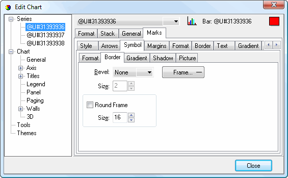
The Border subpage of the Symbol subpage of the Marks page controls the border for legend symbols in point labels. This subpage has the following options:
Bevel: this setting specifies whether symbols appear with a lowered, raised, or no bevel.
Size: this setting, which is only available if Bevel is set to something other than None, specifies the size of the bevel.
Frame: click this button to display the Border Editor dialog.
Round Frame: turn this setting on to display the symbol with a round frame. You can then specify the size of the roundness.
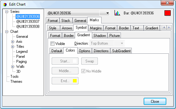
The Gradient subpage of the Symbol subpage of the Marks page controls the gradient settings for symbols. It has the same settings as the Gradient Editor dialog.
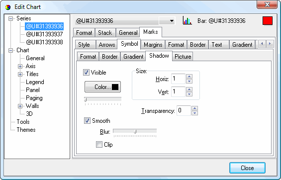
The Shadow subpage of the Symbol subpage of the Marks page controls the shadow settings for symbols. It has the same options as the Shadow Editor dialog.
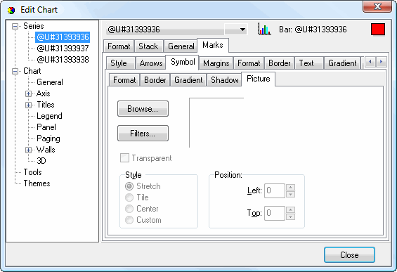
The Picture subpage of the Symbol subpage of the Marks page allows you to define a picture for symbols. It has the following options:
Browse: click this button to display a dialog from which you can select the image file to use for the picture.
Filters: brings up the Filters Editor so you can apply various graphic effects to the image.
Transparent: turn this setting on to display a transparent picture.
Style: this controls how the picture is formatted if the image is a different size than the symbol. The choices are:
Stretch: the image is stretched to fit the symbol.
Tile: the image is tiled to fit the symbol.
Center: the image is centered on the symbol.
Custom: turn this option on to specify where the image should be positioned using the Left and Top controls.
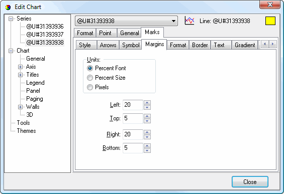
The Margins subpage of the Marks page affects the margins of point labels. It has the following settings:
Units: determines what units the numeric settings in this page have. The choices are:
Percent Font: the values are a percentage of the font size.
Percent Size: the values are a percentage of the symbol size.
Pixels: the values are in pixels.
Left: the left margin.
Top: the top margin.
Right: the right margin.
Bottom: the bottom margin.
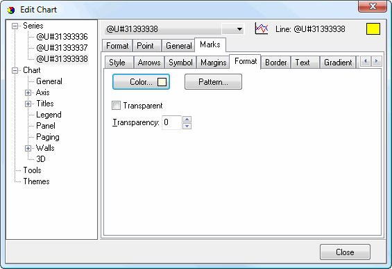
The Format subpage of the Marks page affects the frame of point labels. It has the following settings:
Color: click this button to display a dialog in which you can select the color of the point label background.
Pattern: click this button to display the Pattern Color Editor dialog.
Transparent: turn this setting on to display a transparent frame.
Transparency: use this setting to control the amount of transparency (in percent) of the frame.
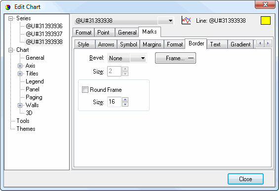
The Border subpage of the Marks page also affects the frame of point labels. It has the following settings:
Bevel: this setting specifies whether point labels appear with a lowered, raised, or no bevel.
Size: this setting, which is only available if Bevel is set to something other than None, specifies the size of the bevel.
Frame: click this button to display the Border Editor dialog.
Round Frame: turn this setting on to display point labels with round frames. You can then specify the size of the roundness.
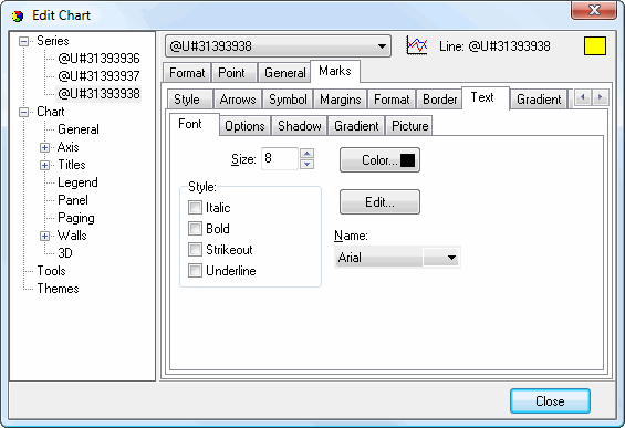
The Font subpage of the Text subpage of the Marks page affects the text in point labels. It has the following settings:
Size: select the size of the text.
Color: click this button to control the color of the text.
Style: select the desired style: italic, bold, strikeout, or underline.
Edit: click this button to display the Font dialog, which allows you to change several of the settings on this page at once.
Name: select the name of the font.
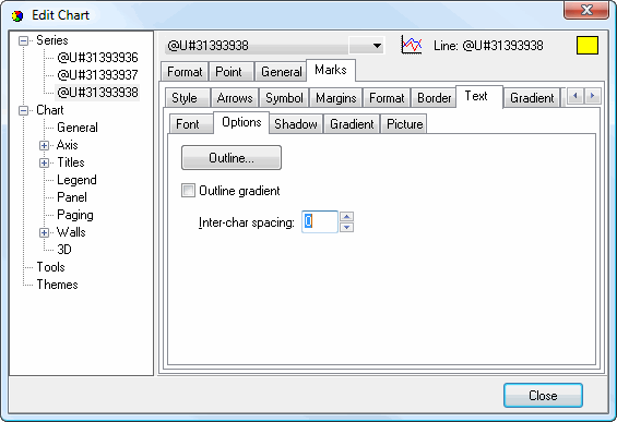
The Options subpage of the Text subpage of the Marks page affects the text in point labels. It has the following settings:
Outline: click this button to display the Border Editor dialog for the outline of the text.
Outline gradient: click this button to display the Gradient Editor dialog for the text outline.
Inter-char spacing: increase the value of this setting to space the characters further apart.
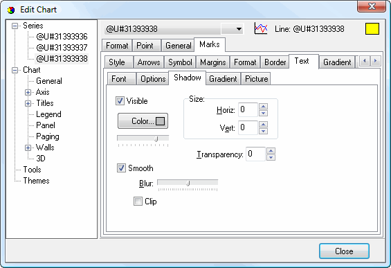
The Shadow subpage of the Text subpage of the Marks page affects the shadow of text in point labels. It has the same options as the Shadow Editor dialog.
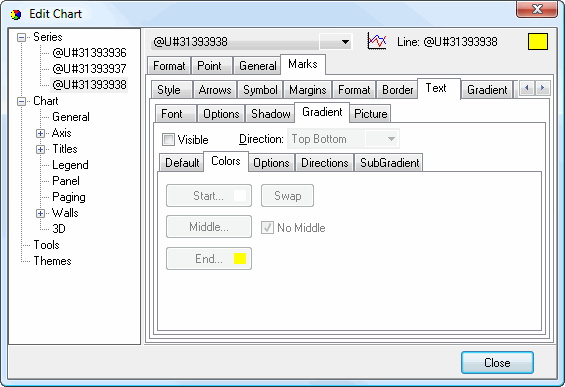
The Gradient subpage of the Text subpage of the Marks page affects the gradient of text in point labels. It has the same options as the Gradient Editor dialog.
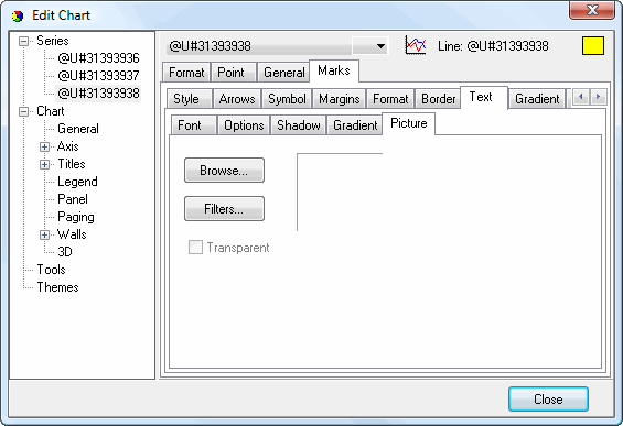
The Picture subpage of the Text subpage of the Marks page allows you to define a picture for point label text. It has the following options:
Browse: click this button to display a dialog from which you can select the image file to use for the picture.
Filters: brings up the Filters Editor so you can apply various graphic effects to the image.
Transparent: turn this setting on to display a transparent picture.
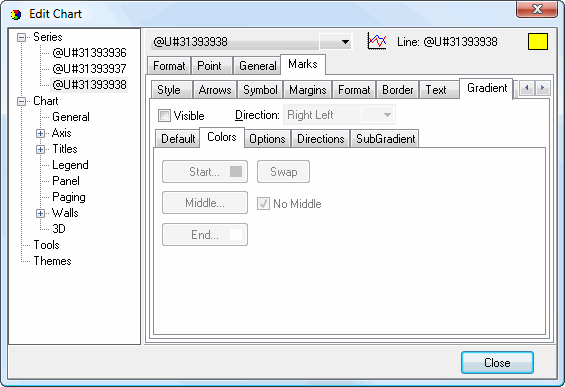
The Gradient subpage of the Marks page controls the gradient settings for point labels. It has the same settings as the Gradient Editor dialog.
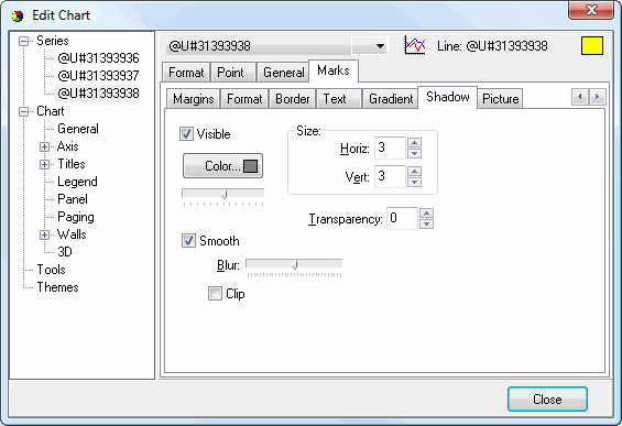
The Shadow subpage of the Marks page controls the shadow settings for the frame of point labels. It has the same settings as the Shadow Editor dialog.
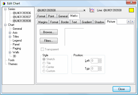
The Picture subpage of the Marks page allows you to define a picture for point labels. It has the following options:
Browse: click this button to display a dialog from which you can select the image file to use for the picture.
Filters: brings up the Filters Editor so you can apply various graphic effects to the image.
Transparent: turn this setting on to display a transparent picture.
Style: this controls how the picture is formatted if the image is a different size than the symbol. The choices are:
Stretch: the image is stretched to fit the symbol.
Tile: the image is tiled to fit the symbol.
Center: the image is centered on the symbol.
Custom: turn this option on to specify where the image should be positioned using the Left and Top controls.
© Stonefield Software Inc., 2025 • Updated: 06/07/16
Comment or report problem with topic